
Employment Development Department of California
Date
Role
UI/UX
May-April 2023
Summary
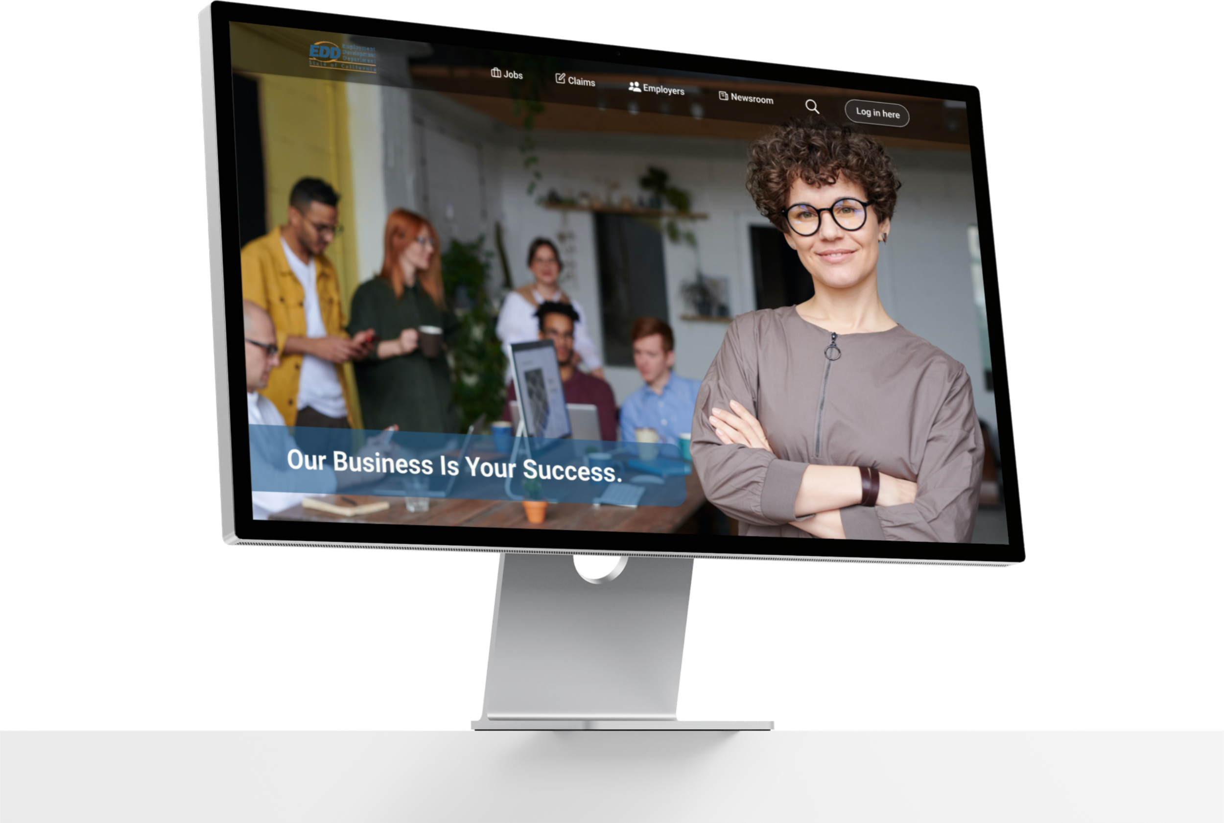
My team and I redesigned the unemployment section of California EDD's website for both mobile and desktop.
The Finished Prototype
Project Background
EDD California is a governmental site with functions including unemployment insurance, disability insurance, paid family leave programs and more .The scope of this project focused on a much needed redesign of California EDD's unemployment benefits. Due to the COVID-19 pandemic, there was a sudden need to update the EDD website. The agency lacked the bandwidth to update the entire site and wanted to prioritize efforts on improving the usability of the function that is used the most, Unemployment. This is where My team and I come in.
The Challenge
The outdated and confusing website needed both a better navigational process and a simple, user-friendly design. We needed a way to create a well organized hierarchy of information. We jumped right in with a heuristic evaluation. EDD’s site was failing 7/10 heuristics, however it was failing significantly more in some areas than others. The main issues lied in Error Prevention, User Control and Freedom, and Help and Documentation.
Here are some examples of the original site below.


The Approach
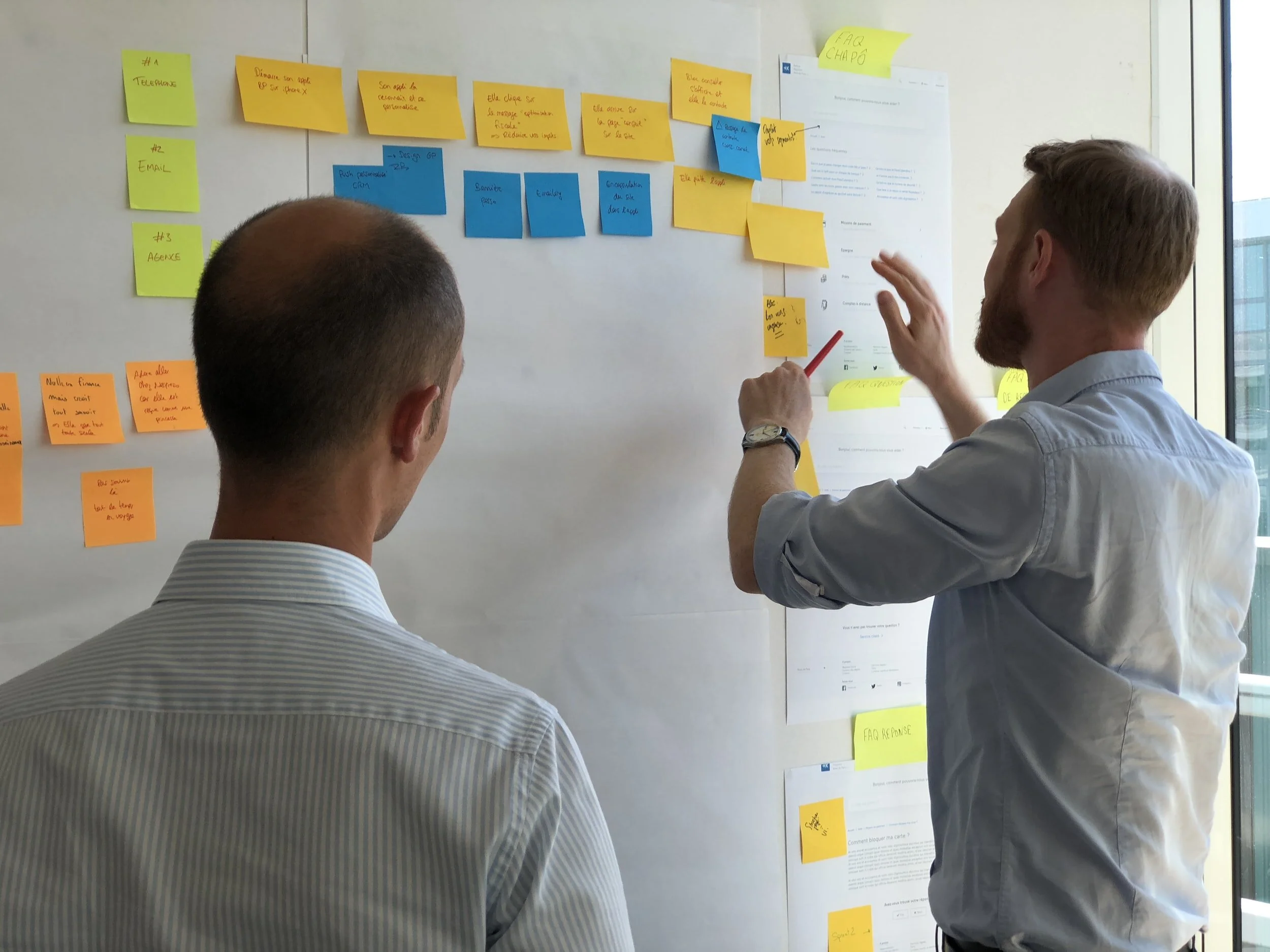
Broadening the search
To gauge user expectations and dive deep to make sure our redesign addresses concerns that may not be apparent, we started with interviewing 5 individuals. We then created an affinity map by grouping individual interviewees' ideas or thoughts with similar themes or patterns. We found 5 key takeaways from these users' experience with EDD's site;
Users felt stressed when navigating the site
The process of applying for unemployment was time-consuming
It was difficult to communicate with EDD staff
There was a lack of information on steps when applying for unemployment
Many visiting the site have disabilities.
Sparking Empathy
With our insights from research, analysis from interviews, and a deep understanding of your audience's motivations and behaviors; we were able to make our users goals and concerns come to life through crafting a persona and journey map. Our persona, Anita, was continuously pulled in all aspects of our design in order to consistently create more relevant and authentic content that speaks directly to their concerns and interests. We started off asking the following questions to address before beginning our design.
How might we..?
Save Anita time and excess stress?
Improve communications with EDD through multiple methods of contact?
Keep Anita up to date on their claims?
Improve accessibility of site to meet Anitas needs?
Design IDEATION
Let’s simplify

After completing sketches my team and I jumped straight into wire-framing. It started with addressing our largest concern, information hierarchy. There was a lot of information per page so I decided to create a layout of one task per screen to not overwhelm the user. After organizing the layout of our screens it was time to focus on visuals. Many visiting EDD’s website also are visiting for disability insurance. It was dire that our design be accessible for those with impairments so we included large buttons, logos, contrast, etc.


Task 1
4/4 Users completed the task with direct success
Time averaged was 26 seconds
Task 1
6/6 Users completed the task
10.3 % misclick rate
Time averaged was 8.4 seconds
USABILITY TESTING& ANALYSIS
Testing Early = Saving Time
We tested our design while it was still in the mid fidelity phase. Testing earlier on helped save us time when designing for our second iteration. For our first iteration we conducted 5 moderated tests and gave our users 3 tasks for mobile and desktop.
Mobile Results
Task 2
6/6 Users completed the task
15 % misclick rate
Time averaged was 40.8 seconds
Task 3
4/4 Users completed the task with direct success
Time averaged was 14 seconds
Task 3
6/6 Users completed the task with direct success
Time averaged was 2 seconds
The Glow-up
For our second iteration we conducted unmoderated testing through the platform Maze. We had a total of 7 testers for mobile and 4 for desktop.
The following data is pulled from our 2nd iteration.
Desktop Results
Task 2
4/4 Users completed the task with direct success
Time averaged was 1 minute & 37 seconds
Overall there was a large improvement from our first iteration to second. However it was decided that we could improve information hierarchy even further. I also eliminated any unnecessary screens that caused users confusion. And lastly I improved the visual design to be sleeker and better suited for those with visual impairments
The Breakdown

Mobile
As seen above there were drastic improvements! Both task completion rate and average time significantly decreased for mobile and desktop sites. My team and I were extremely excited to see such good news.
Comparing Iterations

Desktop
Here’s an example of a revision made to improve information hierarchy. The log in button was relocated as it was unnecessary and took away from the pages main action.

How do users feel?
We wanted to gage how users felt about using the prototype overall. We asked participants to give a satisfaction rating out of 10. On average the rating from the users was 9/10. We were happy to hear participants found our prototype both intuitive and user-friendly. My team and I gave one another virtual high-fives for successfully redesigning EDD to meet out users needs.
Next Steps
Theres always room for improvement. In the future I would like to Increase the direct success rate to at least 90% on both desktop and mobile for task 1, Conduct AB testing comparing the original EDD site to our redesigned site, and lastly compare user task time of inputting dates via dropdown menu vs visual calendar using AB testing.